In CSS there is a hardly known formatting feature for text called text-shadow and this will do exactly as it sounds and display a shadow against the text. This can be quite useful when overlaying text on a textured or image background.
This command can be used in place of a graphic with a corresponding increase in page load and render speed.
CSS Usage:
text-shadow: left-offset bottom-offset [optional blur] colour
In this block of HTML I have added the tag as inline CSS for simplicity but it should ideally be added in a style sheet. The example below will show various permutations of the tag.
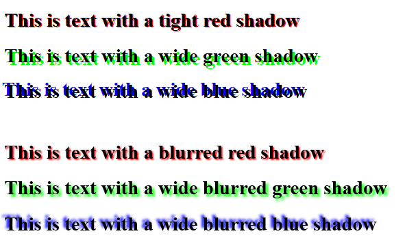
<h1 style="text-shadow: 2px 2px #ff0000">This is text with a tight red shadow</h1>
<h1 style="text-shadow: 4px 4px #00ff00">This is text with a wide green shadow</h1>
<h1 style="text-shadow: -4px -4px #0000ff">This is text with a wide blue shadow</h1>
<br />
<h1 style="text-shadow: 2px 2px 2px #ff0000">This is text with a blurred red shadow</h1>
<h1 style="text-shadow: 4px 4px 4px #00ff00">This is text with a wide blurred green shadow</h1>
<h1 style="text-shadow: -4px -4px 4px #0000ff">This is text with a wide blurred blue shadow</h1>
The above code will produce output like

While some may feel that this is a step back to the golden age of web pages in the 1980s where everything had a grey background and it was almost mandatory for text to be displayed in rainbow colours, this CSS function does have at least one practical use.
For example:

In the above example the white text has a black shadow which makes it easier to read against the ‘busy’ background. This is simpler and cleaner to do in CSS than add the shadow and text to the image as if the layout is responsive it will resize gracefully.
It should work on most browsers although any IE versions below 10 might struggle.