A lot more people suffer from a form of colour blindness than you would think, here in the United Kingdom almost 4.5% of the population suffer with some form of colour impairment. The causes can be varied as can how the actual sight impairment manifests itself. Although there does seem to be a marked difference between the sexes with over 8% of men worldwide as opposed to only 0.5% of women showing signs of colour blindness,
The surprising thing though is how many computer users try to muddle through using the default system settings and struggle with colour recognition, although it is something that UX designers have tried to address in recent years to make the whole user experience easier regardless of any impairments of the user.
The good news though is that Windows 10 comes with a variety of ways to tackle colour blindness or other eyesight impediments straight out of the box, and these can switch on and off to make the user experience much more pleasant. If you suffer from the most common forms of Deuteranopia, Protanopia or Tritanopia then Windows has a filter that will help and can be easily switched on. All applications will respond to these colour changes as it works at a system level and does not depend on how the application was written, the exception here perhaps are those programs will run inside a CMD window, although these usually consist of old data processing code, or even very old legacy PC games.
Windows 10 provides a number of different ways of doing the same thing and as a consequence some of the settings are easily missed, but the easiest way to the correct setting is to type “Colour Filters” into the Search Bar that resides on the Windows TaskBar, or open the Settings tool and search from there.
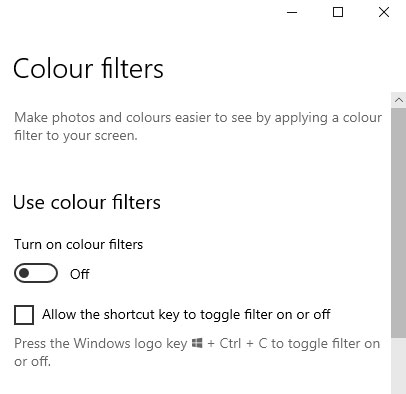
This will bring up the correct page in the Settings tool, and this will show the option to turn on/turn off colour filters. To make life simpler if they have been enabled here then they can be switched on or off at any time using the [Windows Key] + [CTRL] + [C].
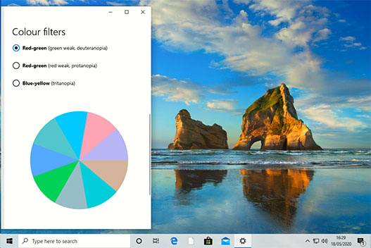
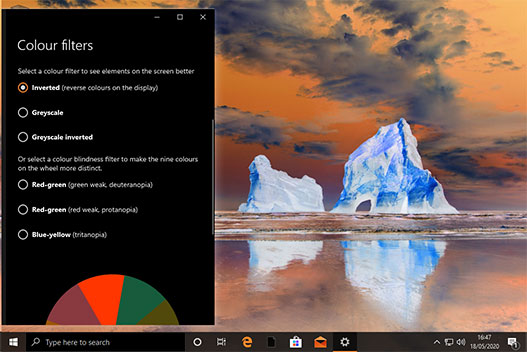
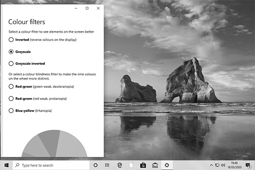
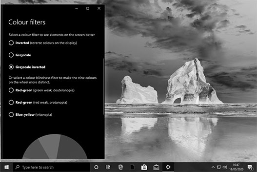
There are a selection of filters for you to choose from.
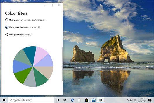
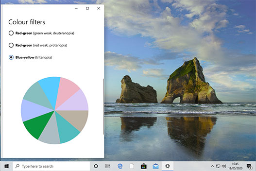
Using a standard Windows background as an example the following three screen shots show the subtle changes each of the settings for the most common forms of colour blindness look.
The Red-Green filter is a correction for Deuteranomaly where users perceive greens to be weaker than they actually are, and this is the most common form of colour blindness.
For users with Protanomaly and a reduced sensitivity to red light, the Red-Green setting will compensate.
The Blue-Yellow setting is for users with Tritanomaly and a reduced sensitivity to Blue light and this is probably the rarest form of colour blindness.
Even if you don’t suffer from one of the above forms of colour blindness there are some other settings that may make viewing the screen more comfortable. These may be especially useful for people with a form of Dichromacy.
All of these colour filters can be switched on and off at any time using the [Windows Key] + [CTRL] + [C] so that if you are working in a shared space and you wish to show something to someone else, or perhaps project from your computer then it can easily be disabled and then switched back on when it is convenient without digging around in the Settings tool.
Finally if none of these improve the on screen viewing then there is always the option of displaying everything in High Contrast.
In the Windows Search bar, or the Settings tool type “High Contrast” to open the High Contrast settings page.
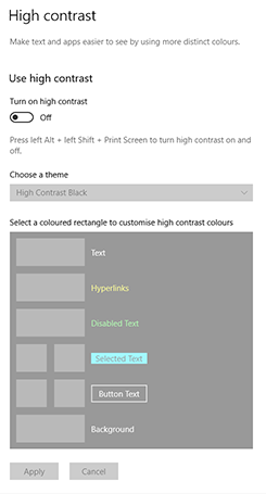
Turning High Contrast on can provide clarity for people with less than perfect vision, although I have often heard it said that it is like taking your fancy colour monitor back to the 1980s when green monochrome screens were pretty much the standard. It can be useful in other situations though where onscreen clarity is more important than displaying sixteen thousand colours, for example in point of sale systems.
This setting removes any extra colours on the display to ensure things are as clear as possible. There are 4 colour sets or ‘themes‘ available and it is not currently possible to create new ‘themes‘ but it is possible to edit the existing settings.
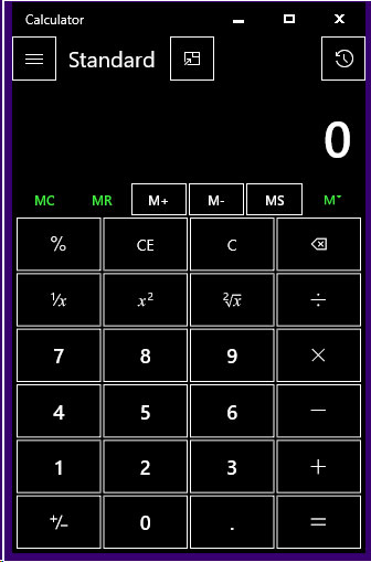
Here is an example of the Windows Calculator in the High Contrast Black theme.
As with the Colour Filters it is possible to switch High Contrast on and off with a keystroke. Pressing [ALT]+[LEFT SHIFT]+[PRINT SCREEN] will toggle the effect.
This is just one of the usability features buried inside the Windows 10 UX, and I hope that you, or any of your users may find this useful.